
onboarding design
teammates
Chatdaddy product team:
UX designers,
Developers,
Product managers
My role
User research
Visual design
User flow
Wireframe
Prototype
tools
Figma
Clickup
Miro
Notion
Slack
timeline
0-2 week: Research & Concept
3-6 week: Iteration & Testing
7-9 week: Prototype & Testing


INTRoduc
TION
01 · what is chatdaddy
In 2018, ChatDaddy, a Hong Kong start-up, was established with the goal of assisting small and medium-sized enterprises in more effectively growing their operations.
02 · why did we do it
In 2018, ChatDaddy, a Hong Kong start-up, was established with the goal of assisting small and medium-sized enterprises in more effectively growing their operations.
03 · what did I do
I led UX and UI across crucial areas of the application side of the platform and supported design across new users' elements of our business.
In a very short period of time, I have experienced significant growth:
• Improved customer engagement. By analysing our main customers' pain points, we created a user flow and user journey map, then built the onboarding process to improve the sign-up rate.
• Improved usability across the platform. Through communicating with the marketing team and developers, conducting user interviews and user tests, I discovered user pain points and improved the accessibility based on that.
define the problems
Business goal

Increase the adoption rate

Reduce Customer Success cost

Increase sales closing efficiency
challenges & strategy

kickoff
In this project, we took the MVP design approach that proved to be quite effective in our design efforts. We found qualitative research methods to be the most useful, consisting of a kickoff meeting, literature review, stakeholder interviews, and most importantly our persona hypothesis construction. We started by asking ourselves some initial key questions.

"What is the product and who is it for?"

"What challenges do the design team and business face moving forward?"

"What do our primary users need most?"

"Who do we see as our biggest competitors?"
understand the problems
We managed the platform while also making improvements because of the limited funding. The previous version only had the bare minimum of features because it was developed without user testing.Because I worked remotely, it was hard to survey lots of customers. I began by summarising some of the pain points based on the data gathered by the Customer Success Team, Sales Team and Marketing Team.
·
From Customer Success Team
1. Unclear onboarding process
2. Missing new feature announcement
3. Too many complaint phone calls
·
From Customer Success Team
1. Old version tutorial videos
2. Low-interest level
3. Confused about the main features
·
From Sales Team
1. Don't know the activity of each client
2. Account open without the sales team, no guidance or support to use
3. Chatdaddy AccountCannot track the reason for cancelling
meet the users
In this project, we took the MVP design approach that proved to be quite effective in our design efforts. We found qualitative research methods to be the most useful, consisting of a kickoff meeting, literature review, stakeholder interviews, and most importantly our persona hypothesis construction. We started by asking ourselves some initial key questions.

primary
Name: Julie
Age: 25
Education: College
Occupation: Merchant
Introduction
Julie is just graduated from college, so she doesn't have too much budget. However, Julie loves sports and decides to earn a living by running her own sportswear shop with friends. She is passionate about creating her own brand and developing her own business.
Pain points
1. Inexperienced in e-commerce
2. Looking to retain regular customers
3. Not working efficiently with the team
4. Identify business opportunities efficiently

secondary
Name: Jake
Age: 34
Education: High school
Occupation: Merchant
Introduction
Jake is a restaurant owner, and he has been running his restaurant for 4 years by himself. He wants to develop more customers and finds a better way to manage his business. Jake really enjoys helping people and is always happy to see people enjoying his dishes.
Pain points
1. Promote the shop and attract new customers
2. Manage income and get business advice
3. Better management of customer relationships
what troubles them most
%20(2)%201.png)
user pain points
Unsatisfied with the design of sign-up process
Inability to quickly understand every page of the platform
Don't understand how could ChatDady help improve their business
Moving towards solutions
After clarifying the importance of the onboarding process and narrowing down pain points, I did research on popular onboarding patterns and how our competitors do it. Analysing their pros and cons could help us make decisions about the next step.
popular onboarding patterns

Competitior's onboarding practices analysis


conclusion
After research, we discussed different methods with other teams. According to our business goals and user needs, new users need quick guidance through important functions while old users prefer detailed information. Our initial decision was to integrate Shopify and WATI's approach.
Build Onboarding Process
To help our new users to get familiar with all the features faster, at first, we decided to use Customer Journey Orchestration. However, due to the tight budget, we had to choose alternatives. After deciding on the channels, I built a user journey map to help us clear all the touchpoints.
what did i focus
in-app channel
1. In-app onboarding
2. Product tour
3. Tool tips
4. Help doc
out-app channel
1. Whatsapp
2. Phone call
3. Email
4. SMS
conclusion
As a UX designer, I mainly focused on the in-app onboarding process and was involved in design of product tour
user journey map
primary
Name: Julie
Age: 25
Education: College
Occupation: Merchant

market research
Because we had a tight timeline and budget, it was important to figure out a way that could save time and money at the same time. It would cost a really long time for developers to develop our own onboarding process, so we decided to employ other professional tools to assist us. We did market research to decide which tool to use.

wireflow & test
After sketching out some wireframes and thinking through the preliminary flow, we reviewed what was necessary, and what areas needed improvement. We poured a lot of our time into this step to ensure we had the finishing touches on the underlying UX before moving on to the visuals.
workflows
iteration
After creating the prototype from low-fidelity wireframes, our team found 5 participants to test our new onboarding process. We asked them to run through different scenarios in our prototype in hope of garnering enough feedback to use for our next set of design iterations.

No progress bar
We found users could get impatient easily when they didn't know how many steps to be finished.

Incomplete options
We found users were confused due to they didn't find their option in the dropdowns.

Accessibility
The initial design used a beautiful gradient of colours, but the lack of colour contrast can cause reading difficulties for some users

Too many taps
Users were having to tap more than once in order to finish every step of the onboarding process.

Improve color contrast to make it more accessible
Stay focused with fewer colours
Highlight the brand

Add animation to explain why and how to connect to whatsapp
Add a preview to be more intuitive
style guide & hi-fi prototype
style guide
Combining vivid colours to create ChatDaddy's signature gradient came from wanting to express to users just how it brings surprises. The onboarding screens feel exciting and welcoming enough to draw the user further in. It's also the only place where it's applicable to use this much colour considering our colourful product selection within the app.

hi-fi prototype
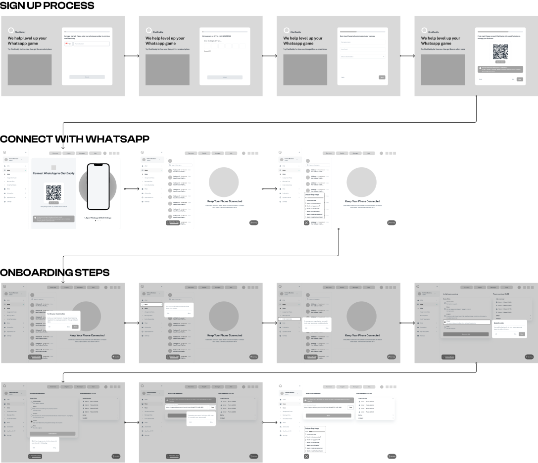
solution 1 : Eliminating Barriers
A key factor when trying to gain a user base is to create an accessible signup process. We just collect the most important information from new users and allow them to skip some steps. Because some users may want to browse the app first before they choose a plan.
solution 2 : stay focused
While the main goal of ChatDaddy is to help users develop their businesses in WhatsApp, users could follow the simple guide to connect their WhatsApp shops quickly, before they come to the onboarding steps.
solution 3 : quick & simple
When users explore the other pages, a product tour could be triggered to guide them through the most important functions. So they could get to know the basic features quickly.
takeaway
·
what did i learn?
This is the first time I take part in the design of a real eCommerce product, and apply a double-diamond model, and design thinking to a real project. I can see the difference my design has brought to new users, which is so exciting. The concept of focusing on persona hypothesis construction to help advance the objectives of the user as well as the business. I learned that if one only relies on experience and imagination to make a design instead of referring to user testing and qualitative research, the design is likely to fail; this seems to be especially true in eCommerce apps.


